
»Emotional Visuals« are the kind of images that don't just show something. They mean something. They carry mood, tone, and intention – and spark curiosity often before you even realize it.

If you want to dig deeper about who I am and what I do you can do that here on my ABOUT page. I work with brands & creatives to shape how they look – but more importantly, how they feel.
Every brand already has something to say – sometimes it just needs help saying it better.
Sometimes that means polishing what’s already there.
Sometimes it means building something entirely new.
I take it – photos, graphics, ideas – and refine them into something sharper, clearer, more aligned with your brand.

It’s not about filters or flashy effects. It’s about creating visuals that are honest but outstanding and memorable. Whether through photography, retouching, or AI-enhanced imagery – the goal is always: not just to make it look good – but to make it feel right.
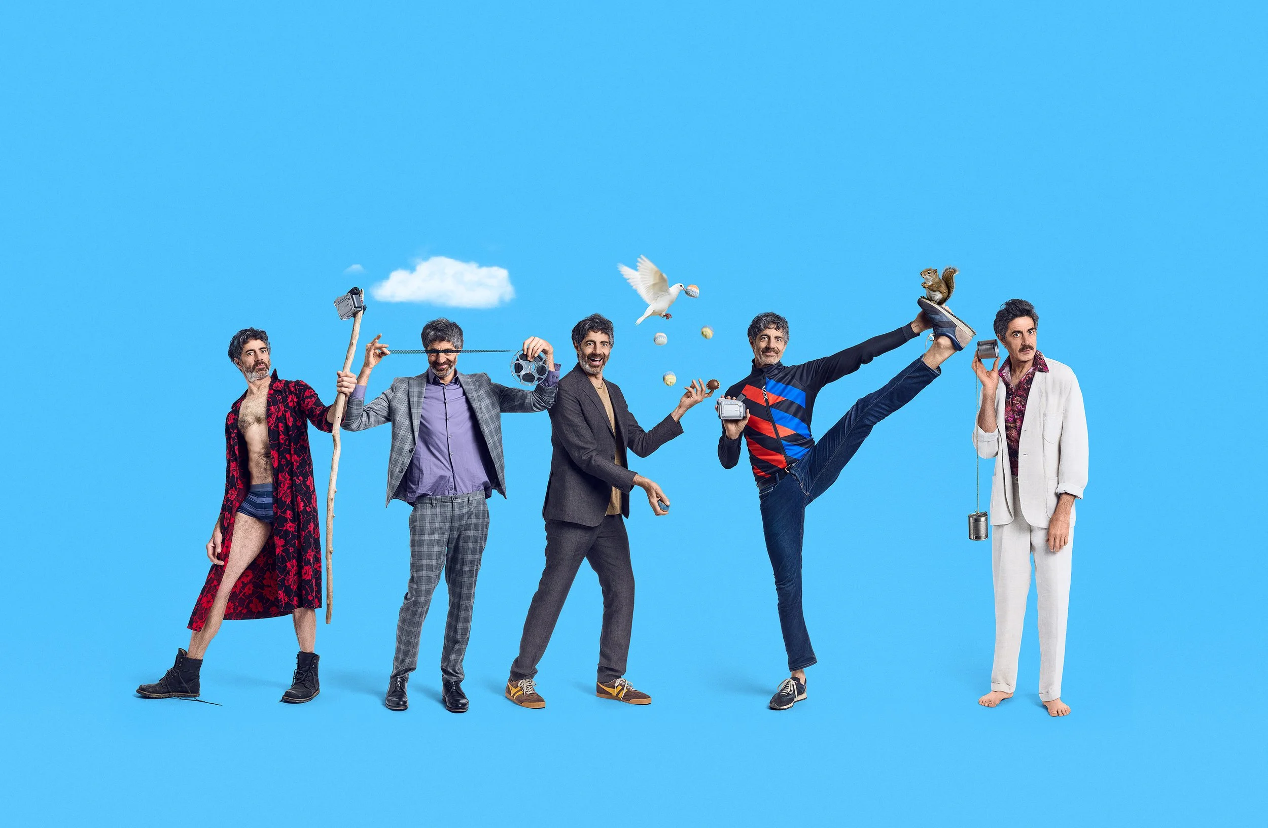
In this case I had to create a complete new website for actor, writer and director Christian Lerch. His original website was just a bunch of loose icons that were linked to his social media accounts.
After a very short period of accessing the concept it became clear that there was not enough existing photography to work with at all. Since his original briefing was imagery that was reminiscent of old Jacques Tati movies we decided to send him to his trusted photographer Nils Schwarz.
I instructed both of them to create some new images where he could literally act out his »inner Jacques Tati« with silly poses and hilarious costumes and weird props in front of a neutral white background.
After the shoot we selected the best poses and I digitally extracted him from the background (including shadows) and retouched the images in Adobe Photoshop manually.
Here and there I added a little sprinkle of AI-generated elements to enhance the images with Adobe Firefly/Nano Banana and Magnific AI.
The final cutout images were placed on bold colorful backgrounds to enhance the positive and loose comedic creativity he touched upon while releasing his »inner Jacques Tati«.

When something’s not there yet, I help build it. That might mean shooting new photos, art directing another photographer on set or creating imagery from stock photos or with AI tools.

In the case of the BBC TV show »TRUST ME« the original key visual from another vendor was rather dark and a little dull which did not represent the look of the show.
Therefore I asked the production for more images from the unit still photographer of the show. After they provided us the new footage I made a composite which was brighter and had a more positive outlook and made their main actress literally shine.

You don’t always need to start from scratch. Often, the raw material is already there – it just needs a little polish to be elevated. I retouch, reframe, and rework existing visuals to bring out their full potential.
It’s about making sure everything feels intentional, professional, and cohesive – so your brand doesn’t just look good, it feels right.
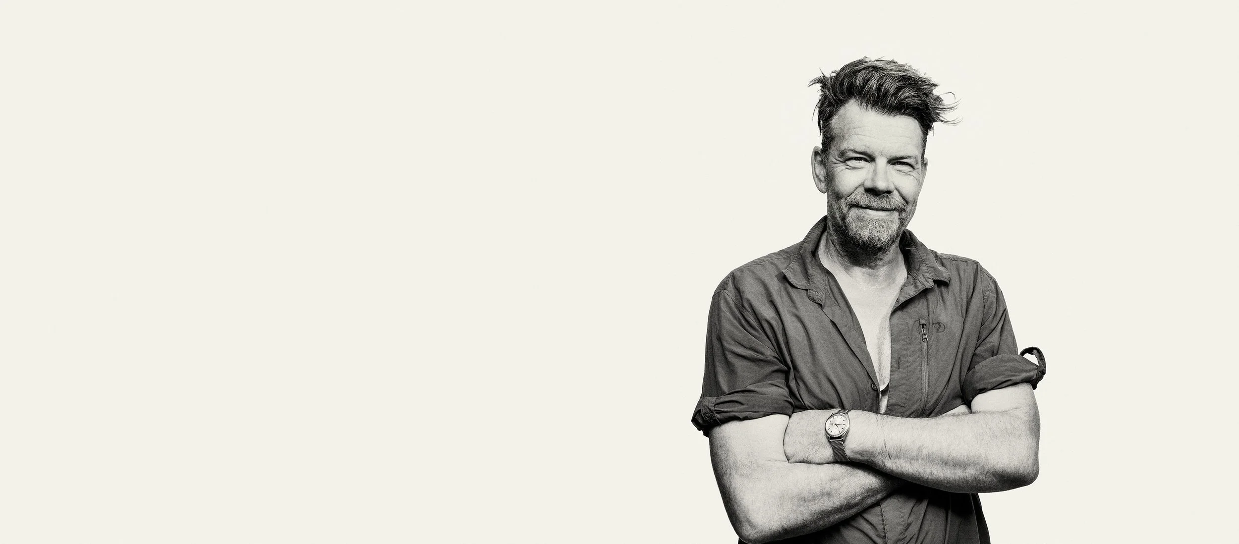

In this case I had to create a new website for german cinematographer Hank Soenke Hansen. His old website was getting outdated year by year and we wanted something simple and bold for his relaunch.
When scouring his visual assets we quickly realized that we had a fairly recent photograph of him. It was a lighting test shot where he was a stand in for a photographer friend. BUT the copy of the image that he had was in a pretty low resolution.
So I used the newly introduced precision upscaler from Magnific.ai and upressed the photo to a usable size. Then I edited the photo in Photoshop using classic methods. I used my Retouch4me plugins because I knew afterwards I wanted to treat the image a little bit »rougher« and raised the contrast to make it look a bit like a Platon or Albert Watson photograph.
In principle we were ready to use it but in the final stages of delivering the website, Hank – my client – feared that he look too grumpy on the photo. Remember that it was a »test photo« back in the day. So using the latest AI technology with Nano Banana Pro in Photoshop we changed his face from »grumpy« to a more happy and approachable face. 🍌🍌🍌

Whatever the source, the process is guided by a clear sense of your brand’s tone and goals. It’s not about throwing visuals together – it’s about crafting the right ones, on purpose.


A few years ago I was asked by the international distributor GlobalScreen/Telepool and production company Constantin Television GmbH to take on the duties to produce a key art for an international teaser poster for the mini-series »The Palace« (»Der Palast«).
After combing thru thousands of images I chose a magnificent image from unit still photographer Julia Terjung and »spiced it up« a little bit visually for use in a 2,5m printed background in Cannes. Additionally I manufactured two small print ads for the UK and US tv guides.

Great visuals don't exist in isolation. Whether it's a TV pitch, a personal brand, or a campaign – I think in contexts, not just images. That means considering background, tone, typography, and format from the start – so the final result works wherever it lands.


When I was approached by Tandem Film & StudioCanal to create a pitch booklet for a TV series called »ATROCITY«. The intent of the booklet was to present the project to potential investors and distributors in order to raise funds for an international production.
The story took place in a fictional country in Africa and a second storyline was set at the international court in The Hague – so visually there was a lot to draw from.
After a few discussions and a briefing we were going on the hunt for interesting photography and grabbed literally thousands of images from international movies that reflected the mood of the story. We think we were on a fascinating visual journey that echoed the cold bureaucratic world of the court in The Hague vs. the rough and lawless imagery of a failed state with a dictator in power.
In Adobe Photoshop I started to create a key visual for the pitch deck and assembled dozens of pages with compelling composite backgrounds where the text would be placed on at a later stage.
In this case the challenge was to create something out of thin air and still deliver a visually striking image that immediately transports you into the heart of the story and show the duality of the different worlds.

Most projects start with one problem and end up somewhere unexpected. That's where I'm most useful – when the brief is half-formed, the material is imperfect, or the idea needs someone who can think visually across the whole project, not just one frame of it.

In this case I had to create a new website for swiss writer & director Marek Beles. His old website was outdated for a few years and had to be revamped.
During the process of creating the website we encountered a regular problem – the profile image on the about page.
Since Marek mentioned that he is a great fan of the movie »Forrest Gump« by Robert Zemeckis he came up with the idea to replace Tom Hanks with himself.
In order to accomplish this task I erased Tom Hanks from the original image and rebuilt the bench with Adobe Firefly in Photoshop. I also got rid of the logo and the feather which I also extracted for further use (see below).
In the meantime Marek – in Zurich – took an image of himself with some props with a 15 year old Canon DSLR and some film lights. I instructed him to wear similar clothes like Tom Hanks in the original image. Afterwards he send me the RAW image and I retouched him with Retouch4me plugins, extracted him and placed him on the bench.
The crucial part was the AI tool »Nano Banana« by Google which was implemented into Photoshop already. So I could re-dress him with the clothes of the Forrest Gump character and add a shadow.
Although using cutting edge AI I still needed to use some old photoshop techniques to adjust for the 28mm lens which was used due to the size of the small home studio. Normally you should use a 50-85mm lens and take a photo from further back – but this option was not available.
Finally I created a custom»Forrest Gump« font and placed the extracted feather on the title treatment. From this image I created a few more formats for social media.


